
Boost Smartphone Photography: Mastering Contrast & Comparisons with Easy Techniques

Boost Smartphone Photography: Mastering Contrast & Comparisons with Easy Techniques
Quick Links
- Why Contrasts and Similarities Appeal
- Old & New
- Color & Mono
- Light & Dark
- Warm & Cold
- Similar Colors & Tones
- Repetition
- Having Fun With the Idea
Seeking out contrasts and similarities when shooting photos can be fun, challenging, and impactful—and it’s often the difference between a good photo and a great photo. Here are some tips and examples to inspire your own creativity.
Why Contrasts and Similarities Appeal
Harmony—things that seem to fit together—is an easy artistic concept to comprehend. We tend to find beauty in compositions in which different elements of the image seem to blend together naturally.
But human beings can be contradictory creatures, and it’s been shown that we also get pleasure from contrasting elements. Artists refer to this as juxtaposition. Indeed, it’s often contrasting elements that most catch the eye.
In this piece, I’m going to suggest four types of contrast you can seek out to create photos that catch the eye, as well as ways to use similar elements for a visually pleasing effect.
Old & New
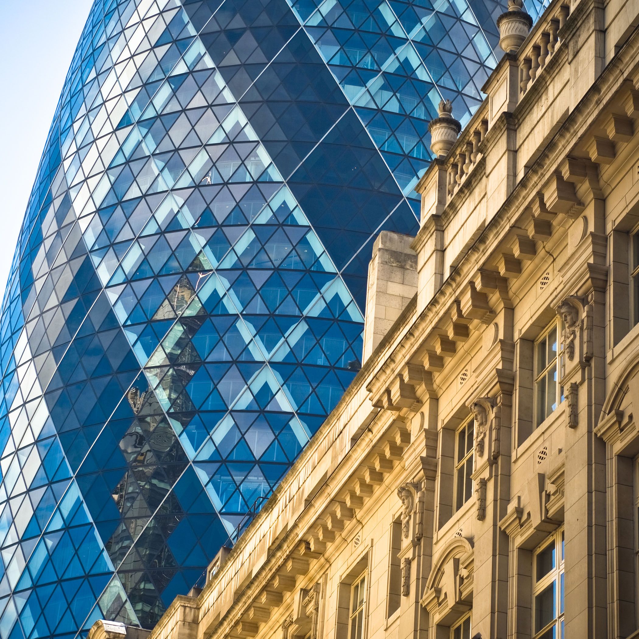
One of the simplest techniques is to combine elements of old and new. This can be really effective in travel shots, for example. Almost every city has evolved over time and will contain a mix of old buildings and new ones, classical and modern architecture. If you can find an angle that brings the two into stark contrast, people will almost always enjoy the effect, even if they can’t say why.
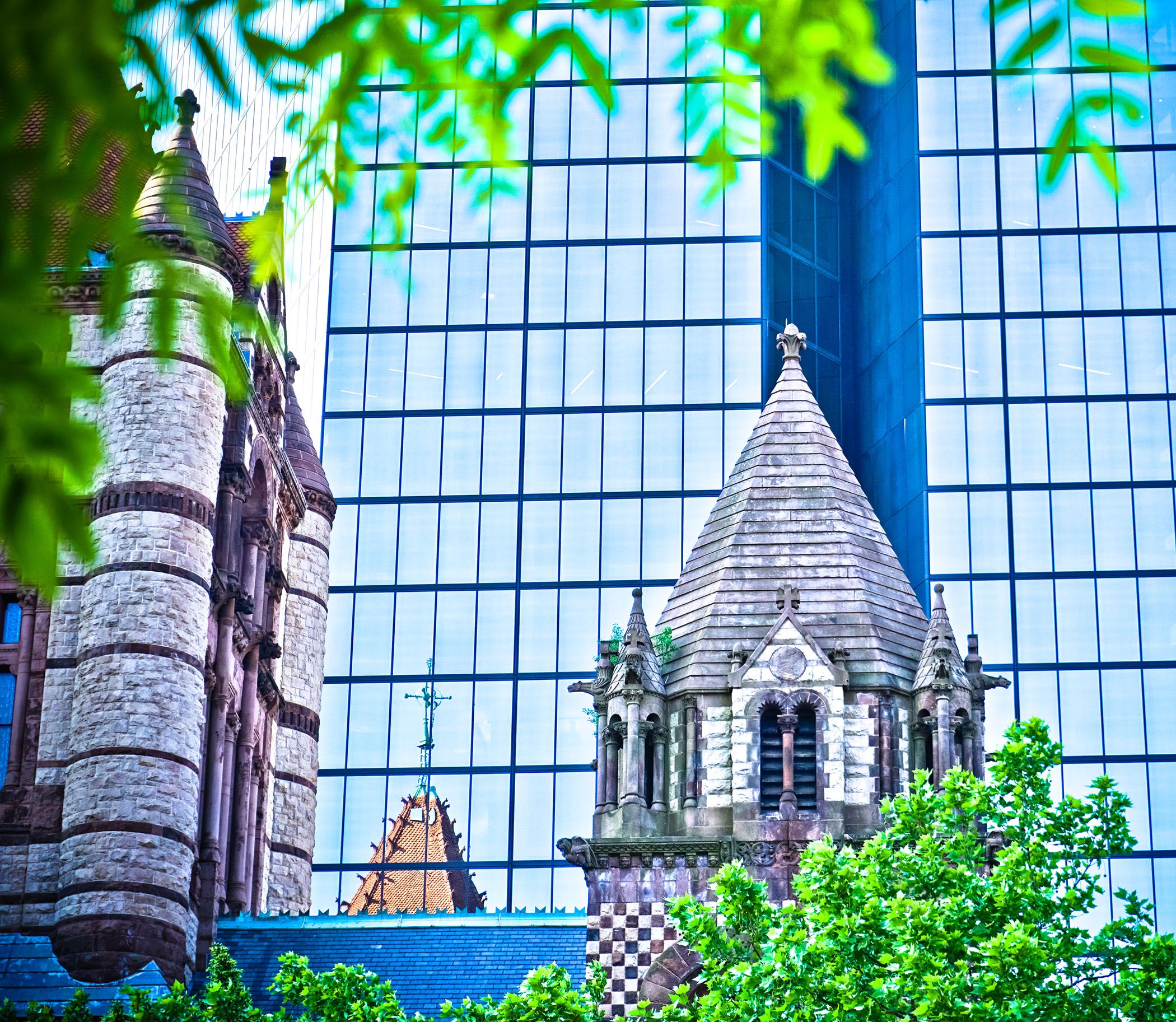
In this example, I’m contrasting the Trinity Episcopal Church in Boston, which dates to the 1870s, with the modern glass-fronted John Hancock Tower behind it. A tight framing means that we exclude other buildings, so these are the only two in the shot. I also use trees, both near and far, to frame the shot, as described in this broader piece on composition .
Ben Lovejoy / How-To Geek
The modern London building here is formally known as 30 St Mary Axe but is far better known around the world as The Gherkin. The round cross-section of the building means it can be photographed from any angle, and I’ve chosen a position here that puts a far older building in the foreground. I’ve again gone in very tight, both to exclude other buildings but also to create more of an abstract-looking shot.
Color & Mono
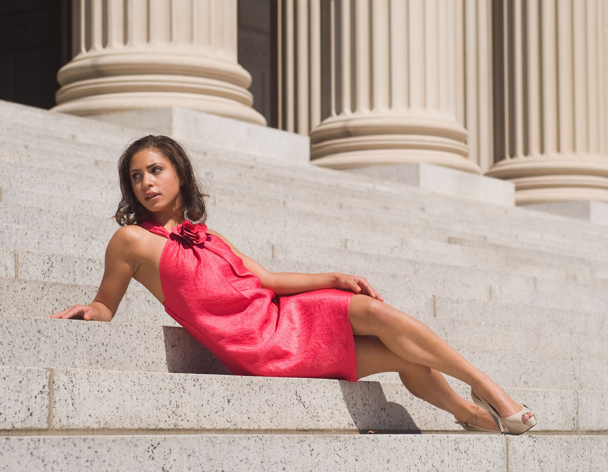
Another simple technique is to find a rather monochrome background, and either wait for something or someone colorful to walk in front of it, or to bring your own colour.
Ben Lovejoy / How-To Geek
In this shot on the steps of a building in Washington DC, I brought along a model in a very colorful dress and then framed the shot quite tightly to exclude everyone else. You’ve probably spotted by now that shooting tight is very often key to excluding any extraneous material.
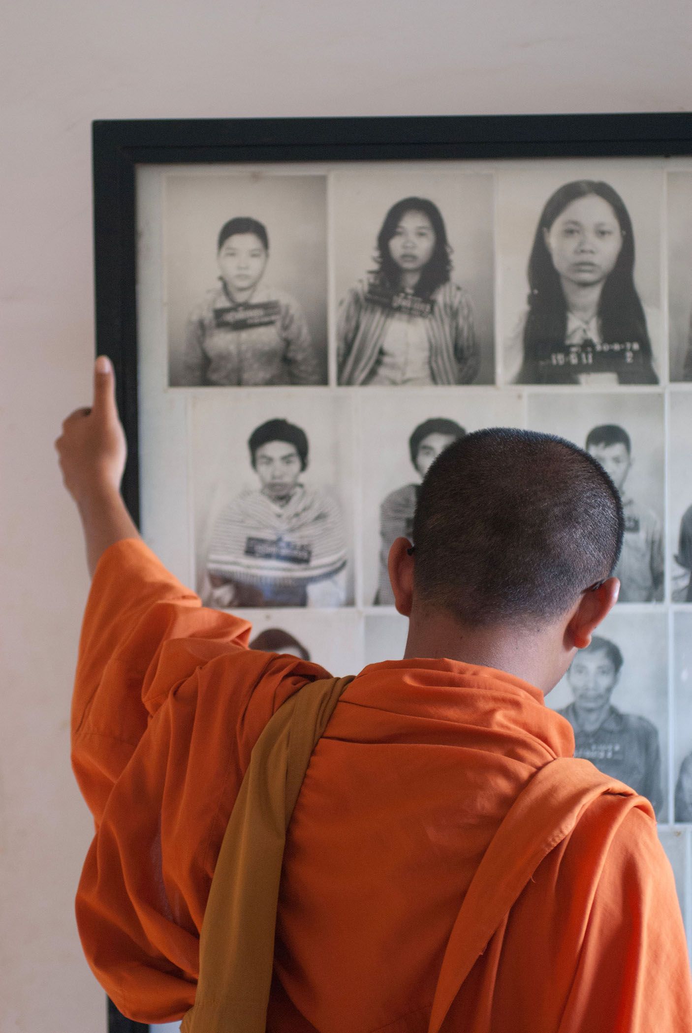
This was a more somber shot, taken inside the Choeung Ek Genocidal Center in Cambodia. The framed black-and-white photos of some of the victims are made more poignant by the colorful robe of the Buddhist monk studying the faces. The contrast helps to convey the message of life and death, then and now.
Light & Dark
Another form of contrast is light and dark, which can be achieved in various ways.
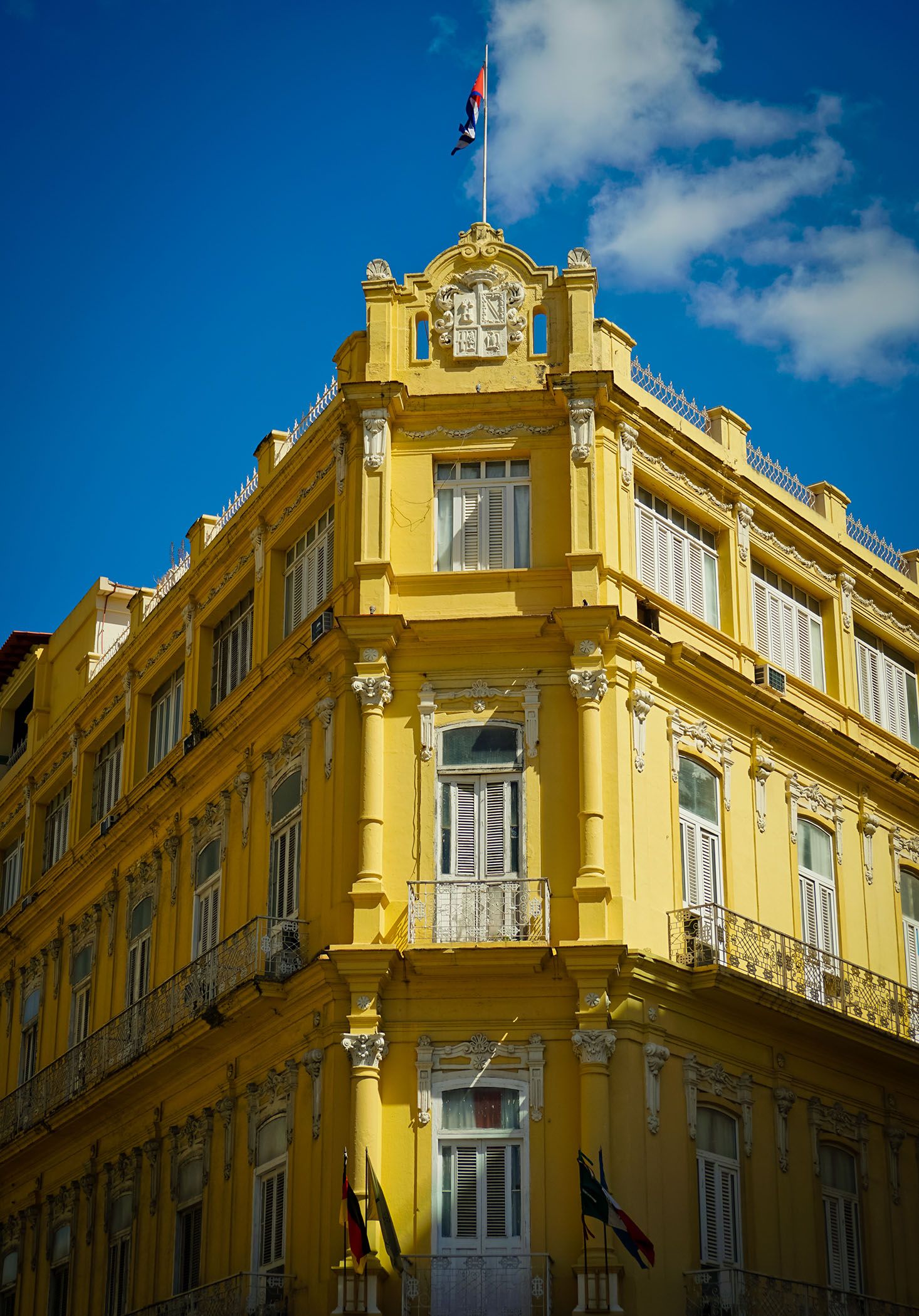
On a sunny day, this is easily done by finding angles that show both brightly lit and shadow areas, as in this example in Havana, Cuba.
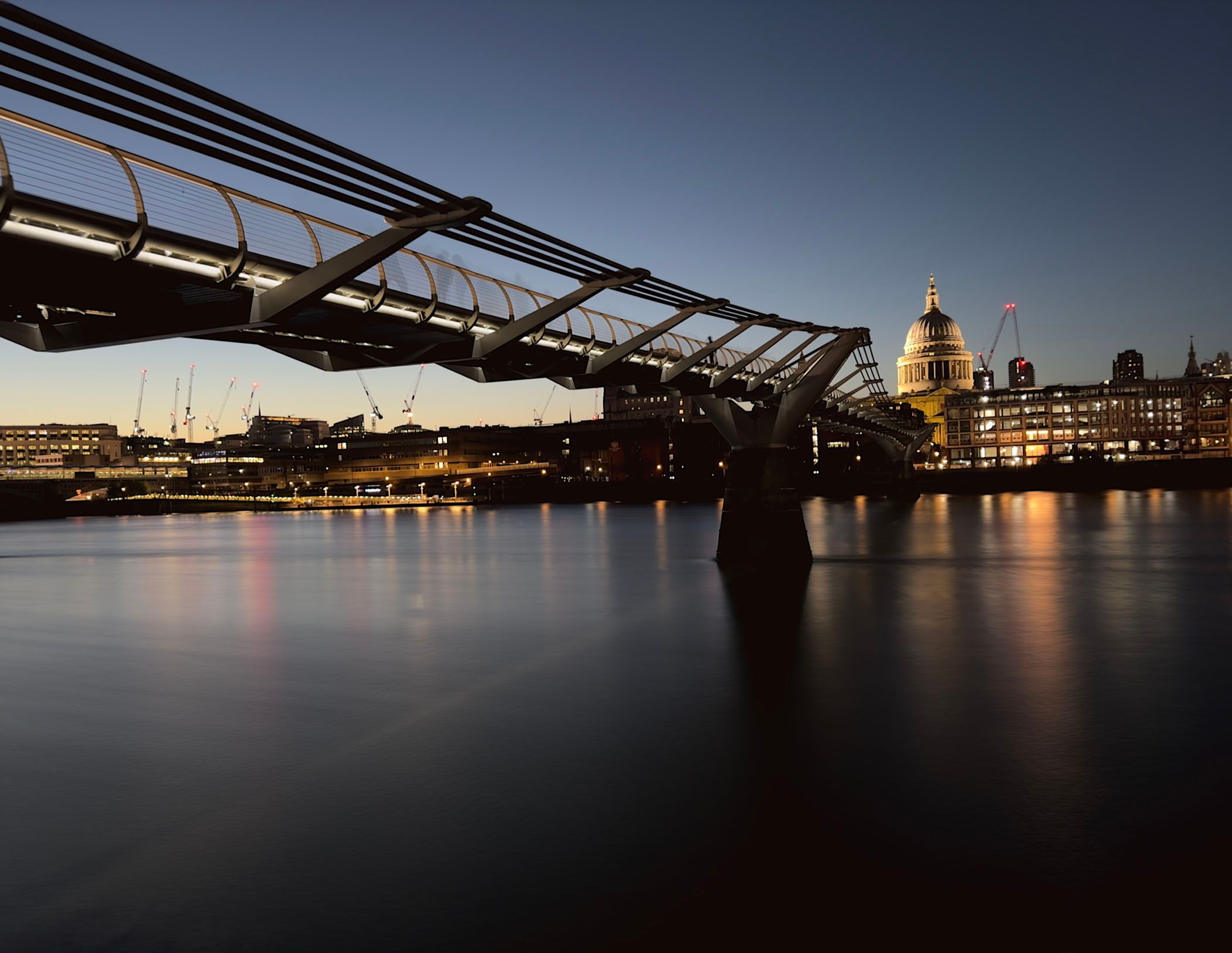
Ben Lovejoy / How-To Geek
This example of the Millennium Bridge and St Paul’s Cathedral in London works in several different ways. Taken in the blue hour—the time after sunset when the sky appears in various shades of blue—has a number of contrasts within it. We have a lighter sky and a darker river. The lighter water surface on the left reflects the sky, and the darker surface on the right is shaded by the bridge and more buildings. We also have the very beautifully designed lighting of the cathedral itself, which was very carefully created in order to create a contrast of light and dark on the dome.
Warm & Cold
In photography terms, we can talk about color temperature. Without getting too bogged down in detail, we describe blues as cool and yellows as warm. Contrasting the two can often convey a literal feeling of warmth and coolness.
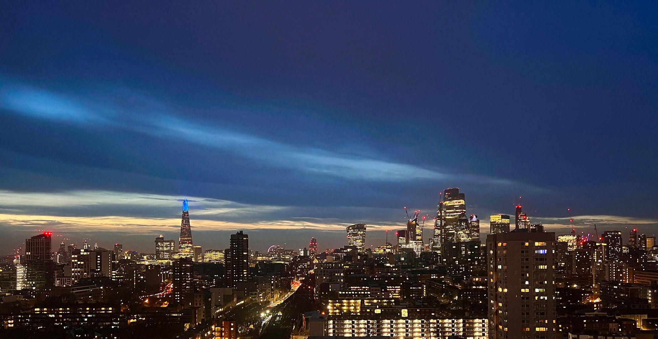
Ben Lovejoy / How-To Geek
The blue hour is often a good opportunity for this, contrasting the cold-feeling blue skies with the yellow warmth of the light from buildings, as in this shot of the London skyline.
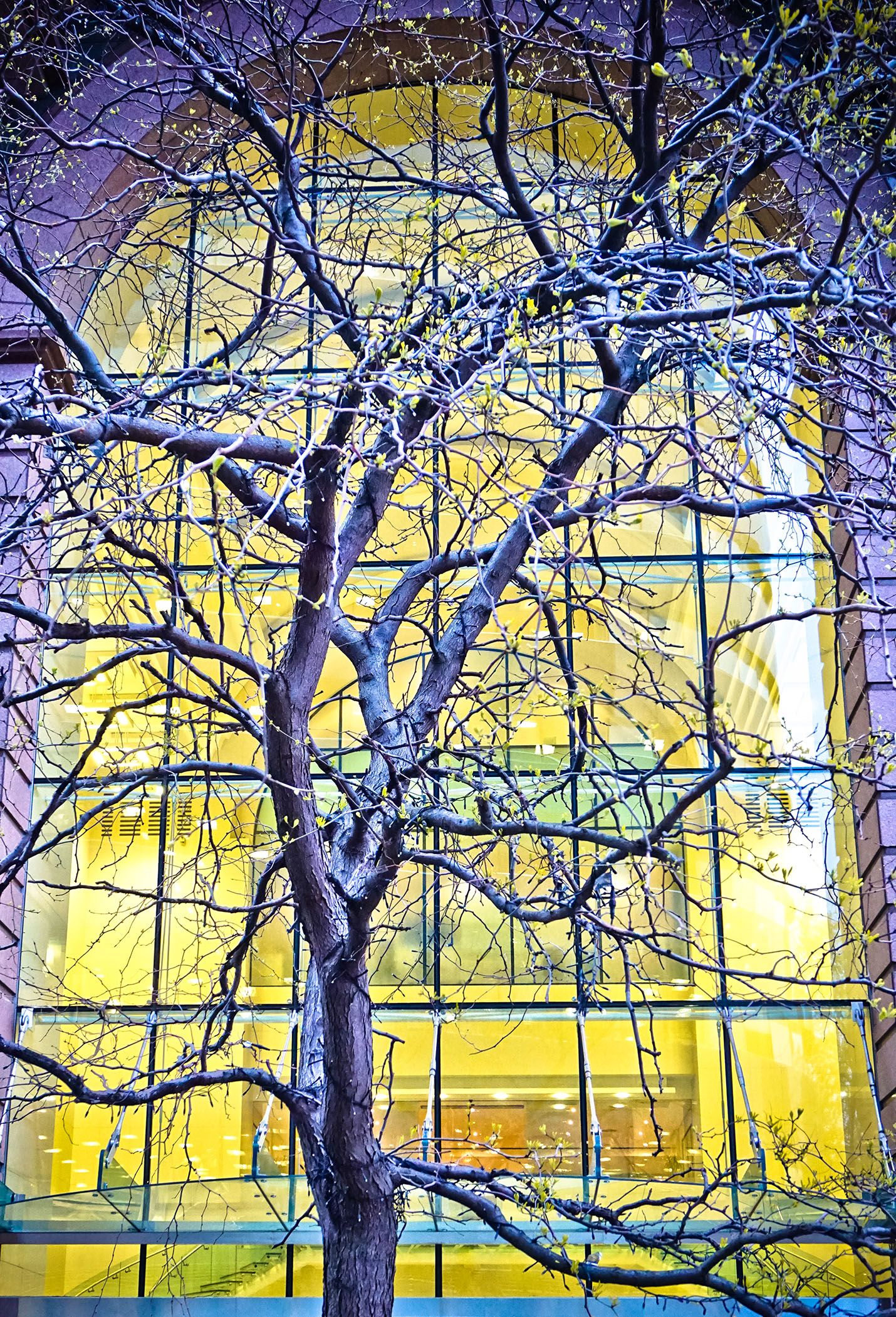
Ben Lovejoy / How-To Geek
For me, this shot of the bare branches of a tree in winter against the warm light from inside the building really conveys an almost visceral sense of cold outside and warmth inside.
Similar Colors & Tones
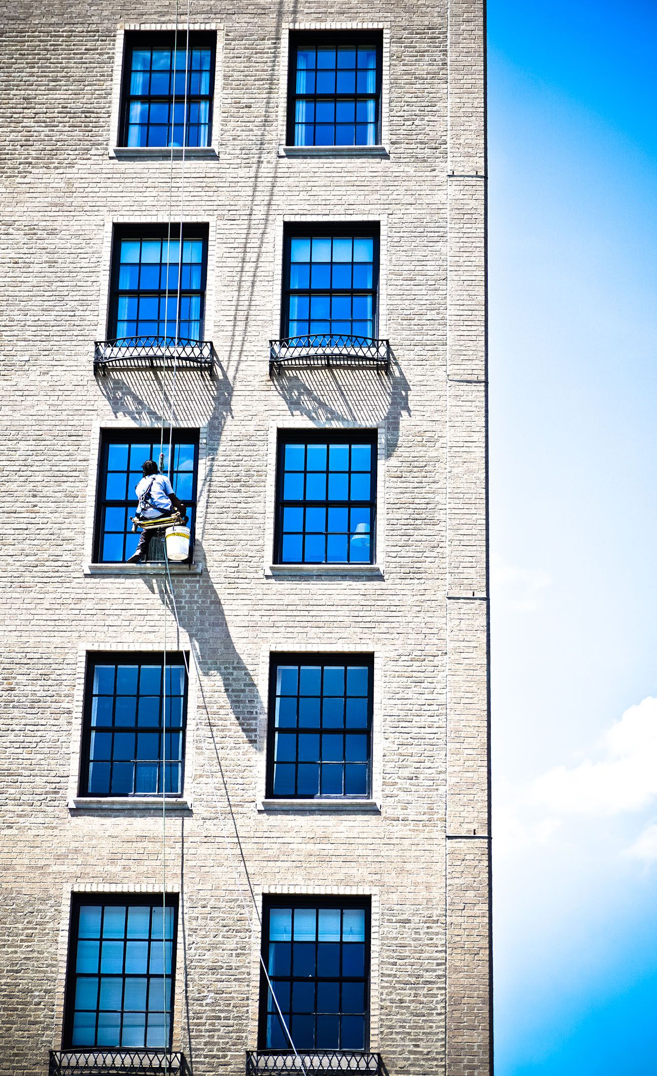
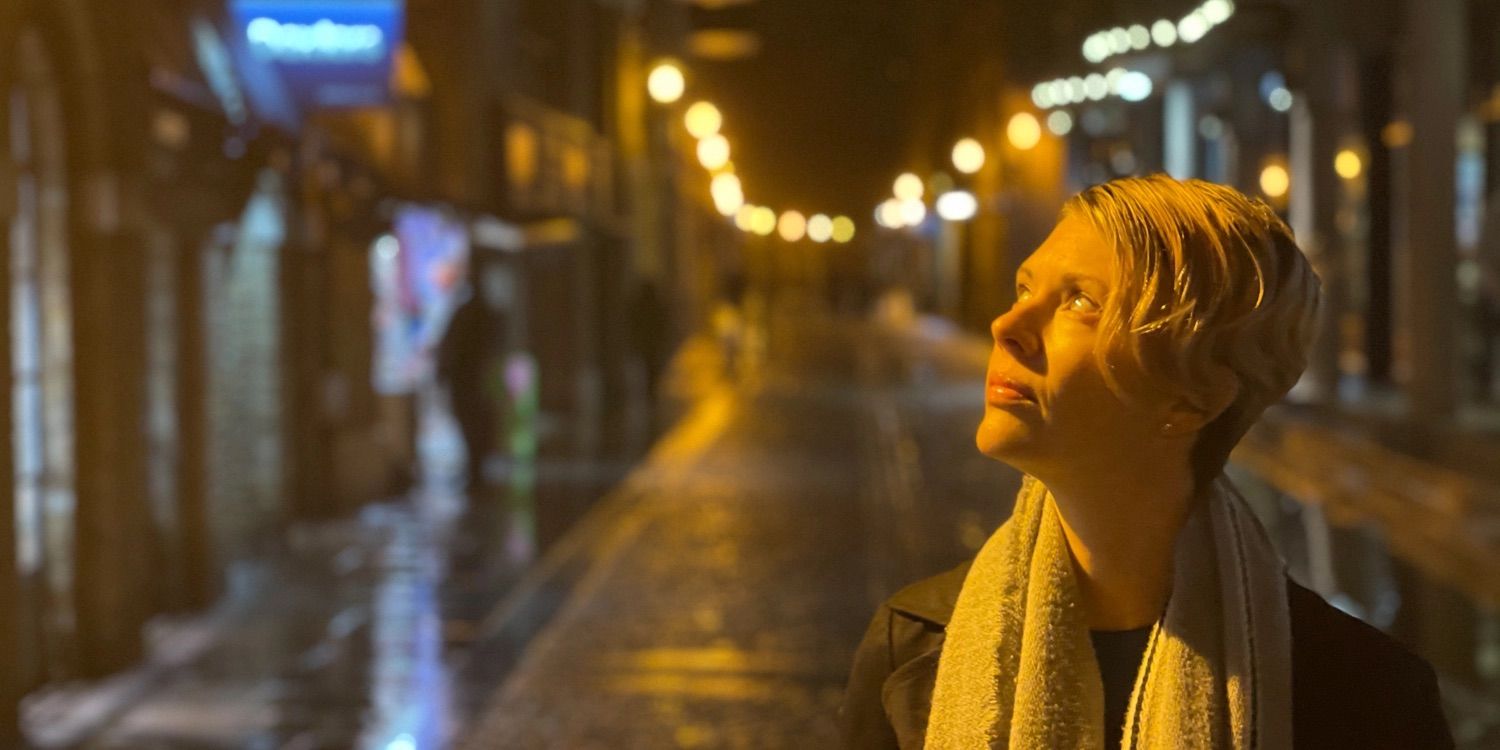
Turning now to similarities, rather than differences, looking out for matching colors can make for harmonious-feeling shots.
Ben Lovejoy / How-To Geek
In this case, we have the blue sky in the background, but also the even deeper blues behind me reflected in the windows of the building. The presence of the window cleaner adds some interest, and we even get some blue tint in his white shirt as it reflects the light from the windows.
Ben Lovejoy / How-To Geek
Here, we have the warm light on a street lamp reflected in the face of the woman, matched by the same warm light from lamps further down the street behind her.
Repetition
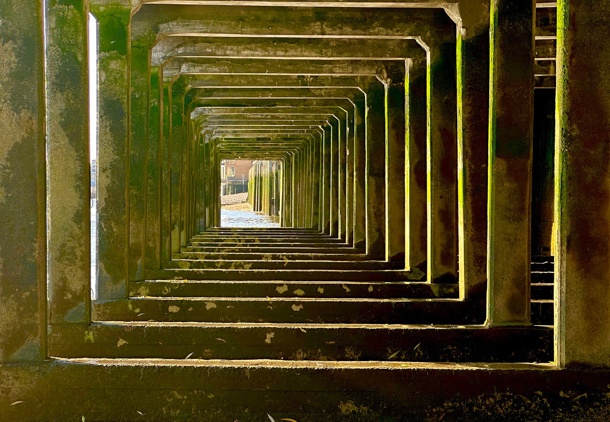
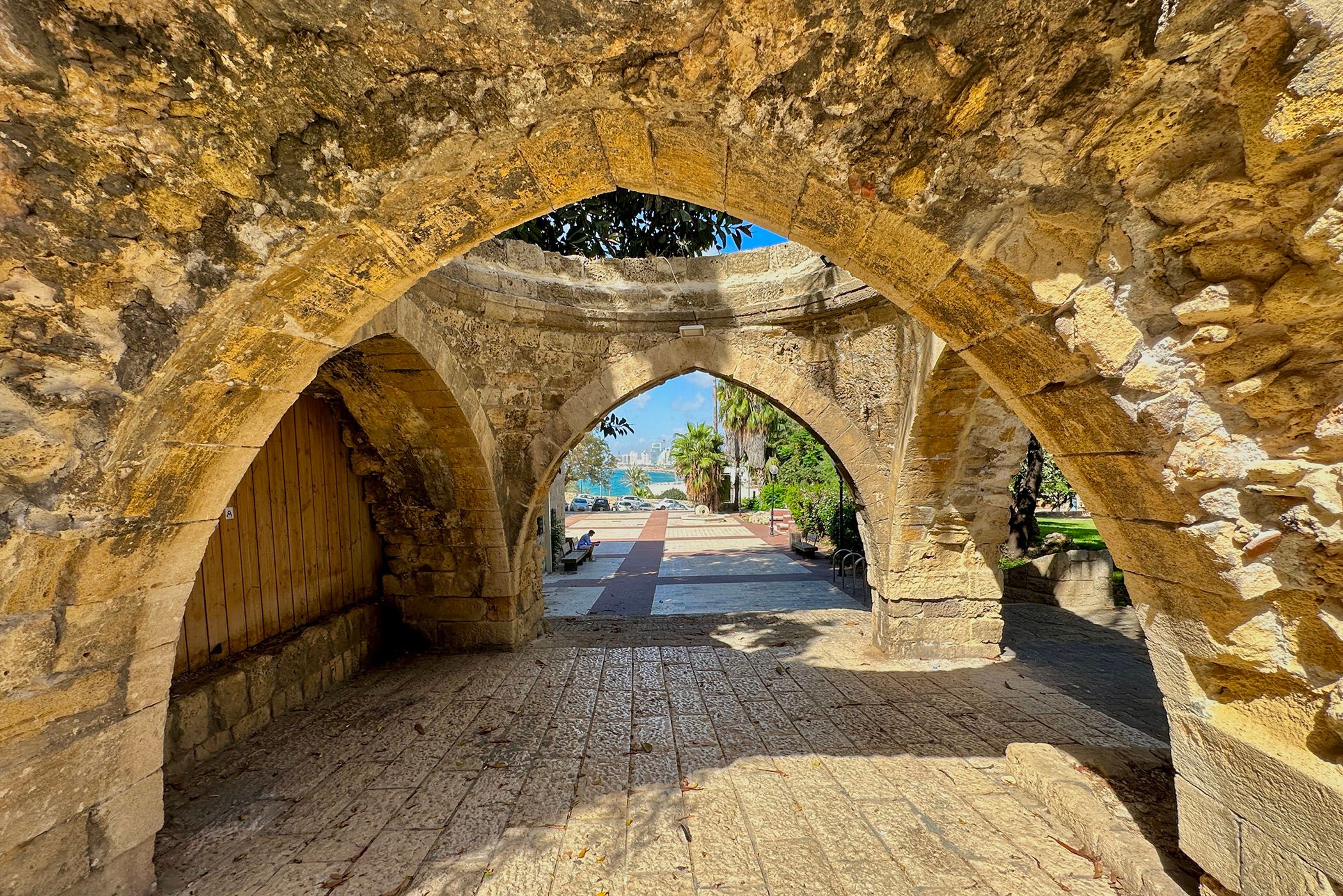
Repeating patterns can be another way to create a visually pleasing image. You’ll want to choose your angle to emphasize the evenness of the patterns.
Ben Lovejoy / How-To Geek
In this example, we have some jetty supports on the River Thames, and I’ve positioned myself to make these match as perfectly as possible.
Ben Lovejoy / How-To Geek
A similar idea with these arches in Tel Aviv. In this case, to get the background view I wanted, I needed to offset the near and far arches, rather than having them perfectly symmetrical, as I’d hoped, but I actually found it was a happy accident, as I like the feel of the offset.
Having Fun With the Idea
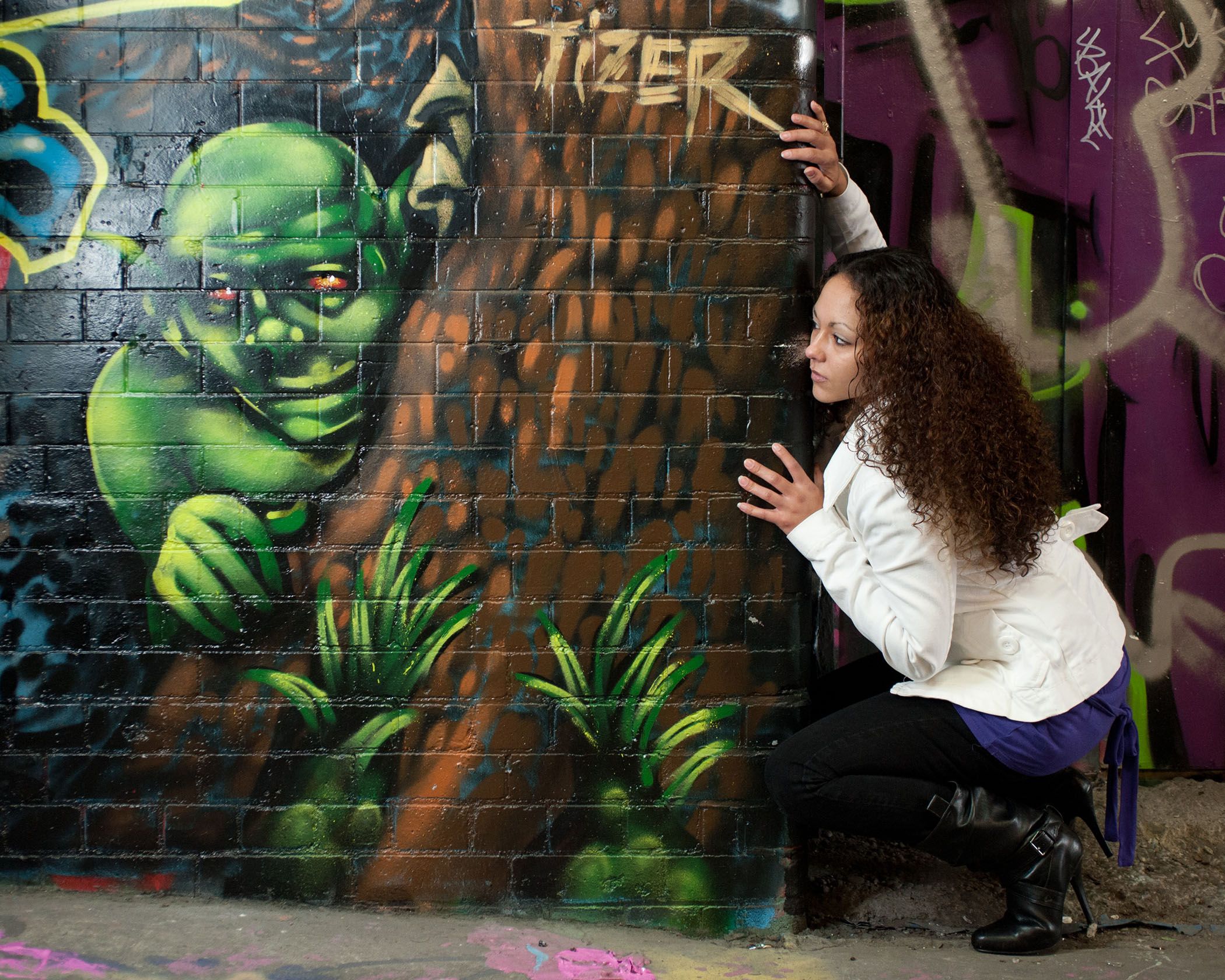
Whether going for similarity and contrast don’t be afraid to play with the idea, and have some fun!
Ben Lovejoy / How-To Geek
Spotting this piece of graffiti in London’s Leake Street, for example, I asked the woman to mirror the pose of the monster.
Ben Lovejoy / How-To Geek
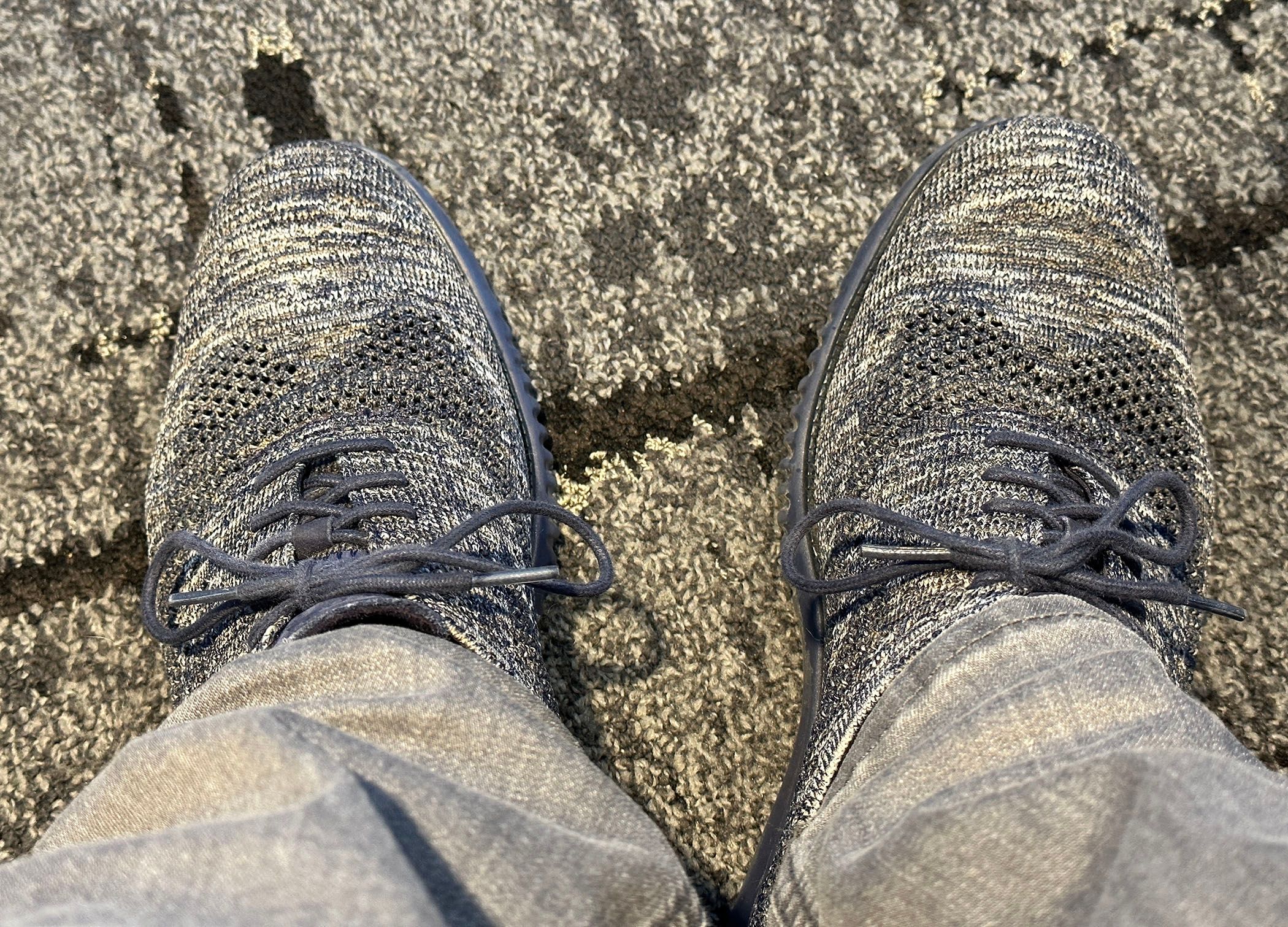
And finally, in an airport lounge in Atlanta, I looked down to find my grey shoes and jeans blending in rather well with the carpet! It made for a fun final shot while waiting for my flight.
Having fun is really the key to any photographic technique. Keep looking around you for possibilities, find the best angle, and keep experimenting.
Also read:
- [Updated] 2024 Approved HilarityHub Online Tool for Funny Image Crafting
- [Updated] Rhythmic Revelations Songs That Will Echo 'Yes'
- [Updated] Sharp Lenses, Clear Visions Tips for Fog-Free Filming
- 2024 Approved How to Download Apple Podcasts?
- DIY Repair Tips for Fixing the Modern Warfare 3 Won't Launch Issue on Your Gaming Device
- Facebook Live Vs YouTube Live Vs Twitter Periscope for 2024
- How To Erase an Apple iPhone X Without Apple ID Password?
- In 2024, Start with Crypto & NFTs Your Simple Creation Plan
- The Showdown: Unpacking the Pros & Cons of Nintendo Switch Lite Vs Nintendo Switch OLED
- The Ultimate Guide to Dying Light's Co-Op Gameplay, First-Person Perspective and Exhilarating Parkour Survival Experience
- To Stay or to Switch: Your Smartphone Dilemna
- Top Acer Aspire E 15 Laptop Assessment - Exceptional Affordable Performance
- Top-Ranking ASUS Network Devices : A Comprehensive Guide
- Top-Rated Giants: Unveiling The Best 17-Inch Laptops in the Market - 2024 Edition
- Title: Boost Smartphone Photography: Mastering Contrast & Comparisons with Easy Techniques
- Author: Kenneth
- Created at : 2024-09-28 21:02:58
- Updated at : 2024-10-01 16:33:39
- Link: https://buynow-tips.techidaily.com/boost-smartphone-photography-mastering-contrast-and-comparisons-with-easy-techniques/
- License: This work is licensed under CC BY-NC-SA 4.0.